
Drafting Experience Redesign
DRAFT | Desktop Web
The Context
Since its founding DRAFT had primarily focused on the daily fantasy sports (DFS) experience for iOS and to a lesser degree Android, but as the company scaled, it was apparent that our web platform needed a revamp. The web experience lagged behind native in both UX and UI and we knew that improving that platform would be important for our growth, since desktop web is often the preferred platform for high volume DFS players.
I was tasked with redesigning the entire DRAFT.com website, but for the purposes of this case study and for brevity, I want to focus on my redesign of the drafting experience on the site, which is arguably the most important user flow for a DFS product.
Our user feedback and competitive analysis showed that our existing site’s drafting experience had a couple of key problems beyond looking dated. First, having the player details card display as a modal overlay, obscured the realtime draft action that was happening, making it harder for users to track what was happening in the draft when doing research on a particular player. Second, the user’s queue, or handpicked shortlist of players, got buried in the existing layout as the user’s team card (or list of drafted players) grew vertically with each made pick.
The Original Web Designs


Initial Ideation
As I began exploring design solutions, I quickly settled onto moving the draft ticker, which is a recap of past picks and list of users who are next to pick, into a scrolling carousel across the top of the page. This design pattern would assure the user never lost sight of the action while still being a more efficient use of space. It also meshed with design patterns being used on ESPN’s popular season long fantasy product. I also started exploring how I might elevate the user’s queue of shortlisted players to a more prominent position.
Sketching Explorations

Wireframe Explorations
As I moved into wireframes, I jumped straight into higher fidelity wires because a crucial stress test for any layout was going to be fitting real data like long player names into the design. At this higher fidelity, I focused on exploring how and where the player details card would come into the interface. In my first concept, I had the card appear inline in the player list, pushing down the rest of the list of available players. In my second concept, I had it appear in the upper right when selected, pushing down the queue module and the team cards module.
High Fidelity Wireframes


High Fidelity Designs
As I took the designs into high fidelity and began applying the DRAFT brand styles, I made a few key design choices. First, I opted to use the primary brand green to denote the user and the secondary brand blue to denote highlighted states of opponents. Second, I grouped all of the content into white cards with drop shadows to both accentuate content groupings and also position the design to be easy to make responsive if product and tech wanted to push forward to a responsive web product instead of desktop only.
High Fidelity Design Exploration


Design Refinements
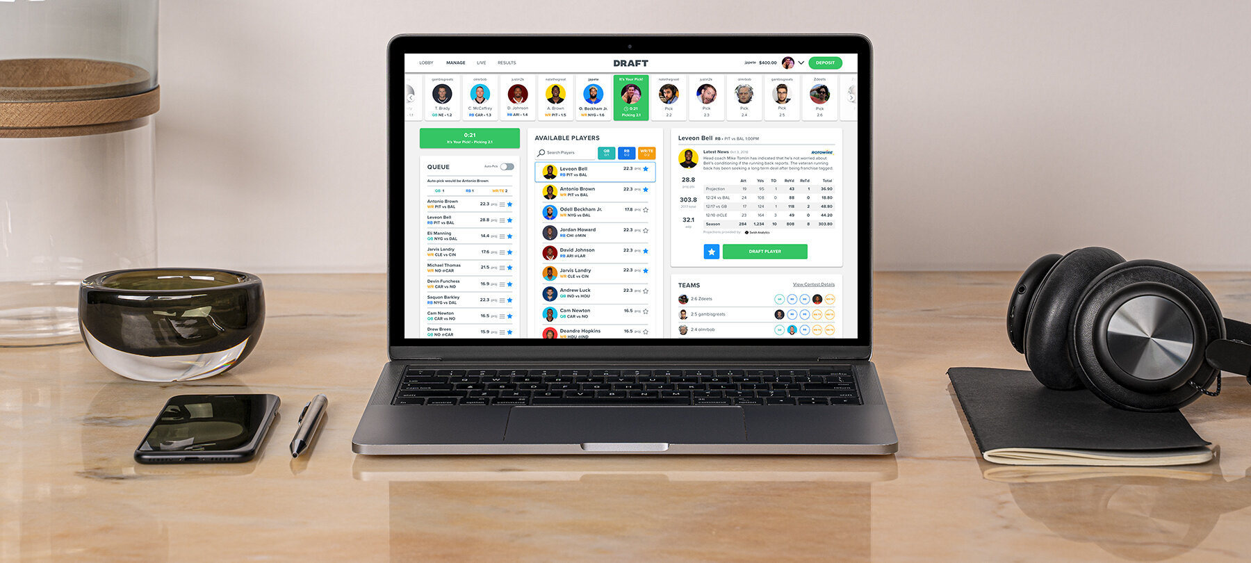
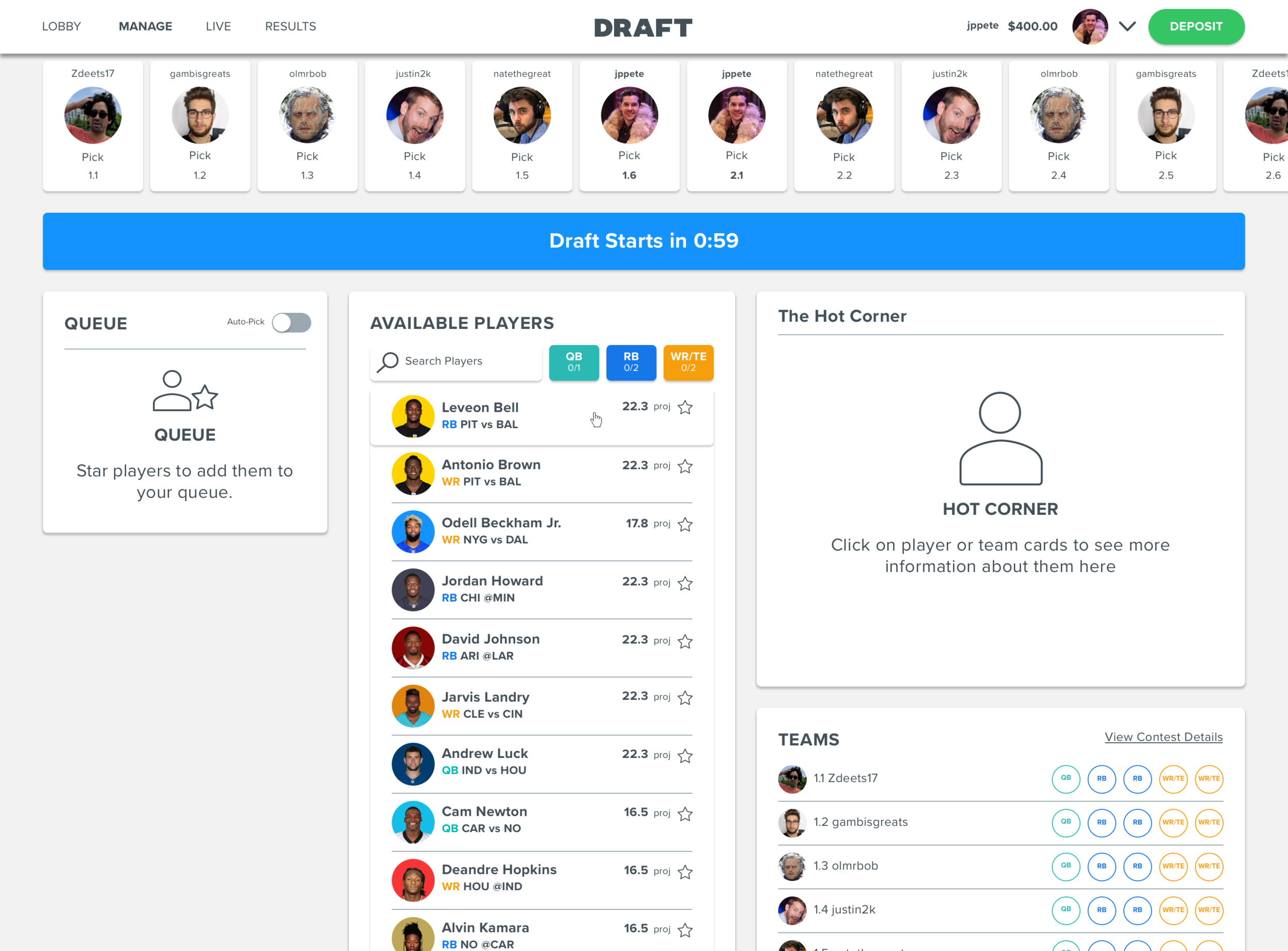
After a quick round of internal user testing, I made some small design changes and one major layout and functionality change. From a layout and functionality perspective, I solved for the player card by creating what we called the “Hot Corner,” which was essentially a permanent content detail view in the upper right corner showcasing player or team details. This detail view could be triggered by clicking on a team or player name virtually anywhere in the UI. In this new layout, the queue also moved to the upper left. These changes avoided the jarring aspect of having content shift around when the player card was triggered while still keeping the user’s queue as a prominent element.
From a design perspective, I enhanced the teams card with a concept we called “headworld” where multiple teams were visible in a snapshot view with player headshots indicated filled positions. From a purely visual perspective, I shifted the background color from white to a soft grey to better highlight the content cards. I also added in a standalone pick clock widget to help users better understand how much time was remaining to make each pick.
Layout and Interface Refinements


Applying the FanDuel Brand
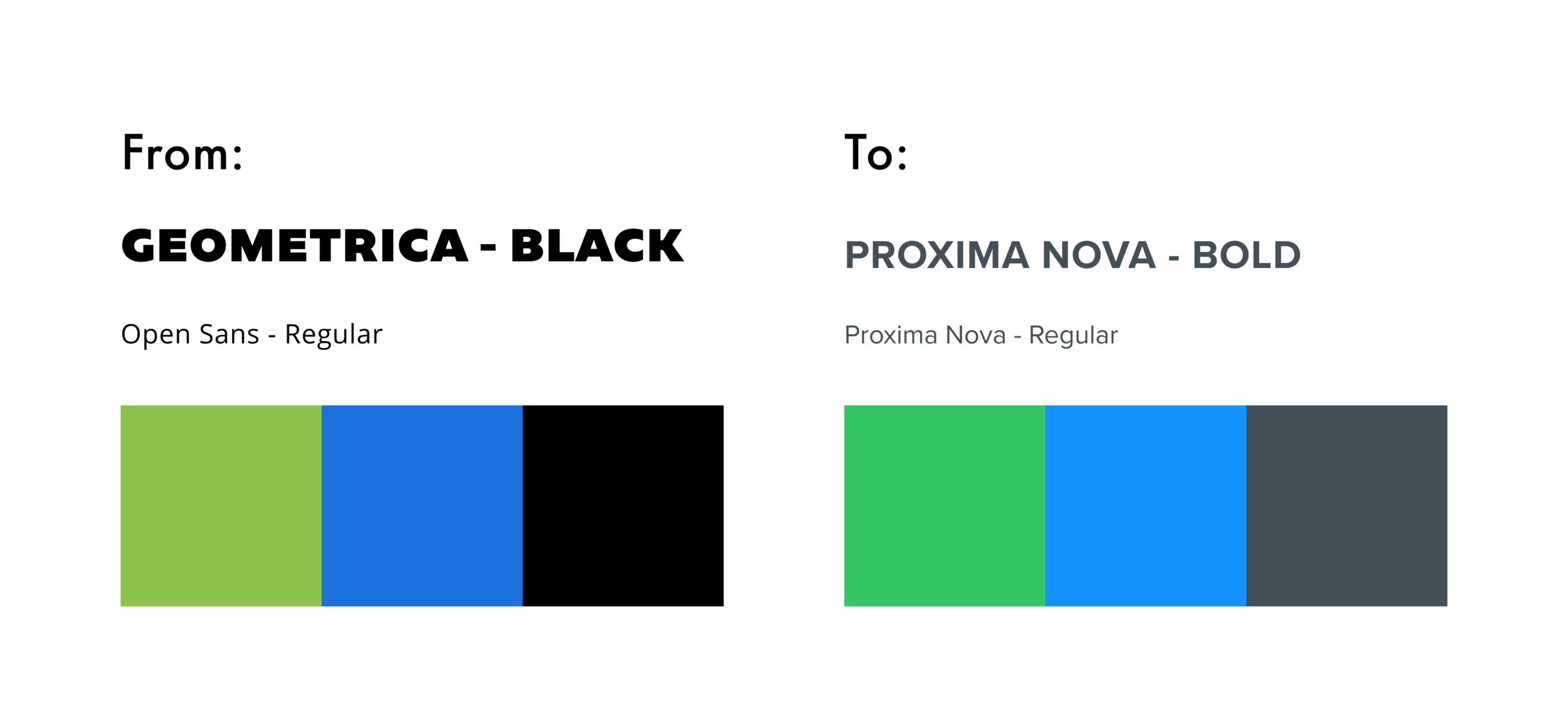
As we neared the completion of this project, DRAFT was acquired by FanDuel, one of the two largest players in the DFS space. In anticipation of an eventual shift towards a single unified brand, FanDuel’s design director requested that we shift the DRAFT brand to be more in line with FanDuel. Obviously, full adoption of the FanDuel visual language would hav been prohibitive from a time and development perspective. However, I adopted their primary font, Proxima Nova, and swapped in their brand green, blue and gray for our DRAFT colors, ultimately elevating the visual style of the final design.
New Visual Branding
Final Designs
The final screens show from left to right and top to bottom, the waiting to fill state, a full draft waiting to start, the first pick in a draft, the user’s pick, an opponent’s pick, and an opponent’s pick with a team card selected for detail viewing.
Final Designs across Drafting States


Results
The new web redesign once launched increased the percentage of drafts completed on web by approximately 16%, and overall traffic to the DRAFT website after the redesign increased by 6.7%.