

Design System Rework
MakeSpace | Design System
The Context
When I joined MakeSpace, it was readily apparent that the company’s product design needed work. In addition to UX problems, the UI across the company’s consumer website was highly fragmented and inconsistent. However, a full-scale redesign wasn’t immediately since our engineering team was focused on a combination of tech debt and adding new bottom line features. However, with an evolving brand design guide and the advent of the tech team’s Material UI component library, I felt like creating a stronger design system would be a logical place to try and make an impact by creating more consistency across all net new designs coming out of MakeSpace.
Thankfully, MakeSpace did have an existing design system set up in Figma. On the other hand, it was readily apparent that a number of aspects needed work. Our typography displayed 20 official styles but had 40 total linked styles (including numerous instances of styles with identical properties but different names) and a naming convention that labeled small fonts as Mobile and larger fonts as Desktop, leading to numerous strange semantic issues where desktop designs had “Mobile” fonts and vice versa. Some elements were simply frames and not components, relatively few components were leveraging Figma’s variant feature, and while our official grid was set up as being an 8-pt grid, not all components were a factor of 8-pts or even 4-pts. And almost the entire system, logos, colors, typography, components, etc was contained in a single, very long artboard on one main page.
For reference, you can view the old design system here.
Grids and Spacing
Our desktop layout grid was one element of the design system that quickly showed its weaknesses. The 12-column grid was based on a 1440-px breakpoint with margins of 120px, gutters of 20px, and approximately 81.67 px columns. There were two obvious problems here. The first was that the column size didn’t equate to a clean round number - no matter how many columns were used. The second was that larger desktop elements tend to need more than 20px of between them for it to feel like there’s enough white space. And in fact, the 20px gutters were the same size as those used on mobile - only the columns were scaling up in size.
The Old Grid Styles

I decided to keep the margins at 120px since it looked good visually, was widely used throughout the site, would be hard to change without breaking designs, and aligned to our 4-pt grid. The next challenge was to find a combination of a gutter that was larger than 20 px and on the 4-pt grid while also yielding a column that was a whole number. I settled on 36 px gutters and 67 px columns.
One other change I made was to delete our tablet grid entirely. There were a couple of reasons for this, but the primary one was that we didn’t actually design for a static tablet breakpoint. Rather our approach to tablet was to annotate for engineering how elements should respond and start to adapt towards the mobile view between 1024 px and 480 px. My reasoning is that a design system shouldn’t document every single edge case as that creates an unusably large design system. Rather it should cover the most common cases in great detail to create consistency and avoid ambiguity.
The New Grid Styles

There were also issues with the sizing and spacing of some elements and how their sizes related to our 4-pt grid. The original large button components \ relied on internal margins on an 8-pt grid with autolayout. But maddeningly, this meant our large size buttons were 55px high (rather than an 8-pt 56 px high. because the button’s size was determined by internal spacing set against the line height of the text within the button (which was set to be 125% of 18 pt type or 23 px high). While line height is ordinarily an important typographic element since it sets the distance between text that wraps onto multiple lines, in a button (which shouldn’t have line wraps), it’s not that important. Since we already had a linked 18-pt text style with a semi-bold weight, but a line height of 25px, I opted to use that text style and then reduce the top margin to 15 px while keeping the bottom margin at 16px, creating a 16-pt button.
The next step was trying to create some standardization around button widths. As mentioned previously, the actual Figma buttons were created with autolayout that would shrink and expand as the CTA text length was changed, and hence the widths of buttons in MakeSpace designs varied widely. In addition to not looking particularly consistent, it was also something our engineering team had requested we attempt to somewhat standardize.
To standardize it, I first reviewed our existing designs to see what types of CTAs we had used throughout the product. I then reviewed our grid to see what common grid widths might make sense to align button widths to. The sizes I settled on after consulting with engineering and the other designers on the team were a two-column width of 170px and a four-column width of 376px for desktop. For mobile, I made the decision that all buttons should generally be full width or 327px. Of course, we also agreed that there will be exceptions and engineering may have to code some custom widths occasionally, but these new standardized recommendations will allow engineering to work faster, make our designs look more consistent, and will also push the team to write button copy more concisely and clearly.
Button Styling Specifications

Revising the Typography
Perhaps the most important revision I made was to audit and consolidate our type styles. The MakeSpace design system uses only one font, MakeSpace Biotif, a san serif, in just two weights, semi-bold and regular. Yet despite the seeming simplicity of our type system, the number of linked text styles made it prohibitive to quickly style text and there was a great deal of either total duplication or near duplication with highly similar sizes and styles. My first step was auditing all of our linked text styles and creating a visual diagram to see just how much overlap there was and just how similar our various styles were to each other.
Audit of Old Type Styles

Many of the linked font styles were labeled as either mobile or desktop, which led to two problems. First, prior designers finding themselves too limited by the available styles labeled for mobile or desktop had used mobile styles on desktop designs and vice versa, stripping these labels of semantic meaning. The other issue was that because there is overlap between the body copy sizes needed on mobile and desktop for example, there was duplication of styles between these two groupings. For example, paragraph small desktop had a weight of regular, a size of 16 pts, and a line height of 140% while paragraph large mobile was also regular, 16 pts, and had a line height of 140%.
Furthermore, various one-off styles that were either close to or duplicative of existing styles had also been created. For example there was a 16-pt, regular weight style called “Textfield Focus” that presumably existed solely for the text in form fields in a focus state, while there was also another 16-pt, regular weight style called “Menu Option.”
I identified four main uses for text. Headings, subheads, body copy, and UI copy (which is typically emphasized or interactive text on specific components). For our heading and subhead styles, we had many similar but not entirely duplicative styles, so I decided to create an entirely new type scale using a major-thirds system from a base font size of 16 pts, rounded to whole numbers, and aligning as much as possible to a four-point grid. I created six heading styles at sizes 60, 48, 40, 32, 24, and 20 and labeled them as headings x-large, large, medium, small, x-small, and xx-small. I also created three subhead styles which mirrored the sizing of the small, x-small, and xx-small headings but in a regular font weight rather than the semi-bold weight used for all headings.
The difference between the UI and body copy styles is that body has a weight of regular while UI has a weight of semi-bold. When it came to the UI and body styles, the main task was simply consolidating and eventually deleting all the unneeded duplicative styles. I settled on UI and body copy font sizes of 18, 16, 14, and 12 which I named large, medium, small, and x-small, enabling them to be used on desktop and mobile alike without any semantic strangeness.
New Type Styles

To maximize implementation of the new styles, I chose to edit and rename existing linked type styles as much as possible, and also reviewed and adjusted our main design files to make sure nothing had been broken too badly by size changes. The other key piece was evangelizing the use of the new styles among the other two designers on the team and encouraging them not to create new styles on the rare instances a one-off style not found in the design system is needed.
Component Updates
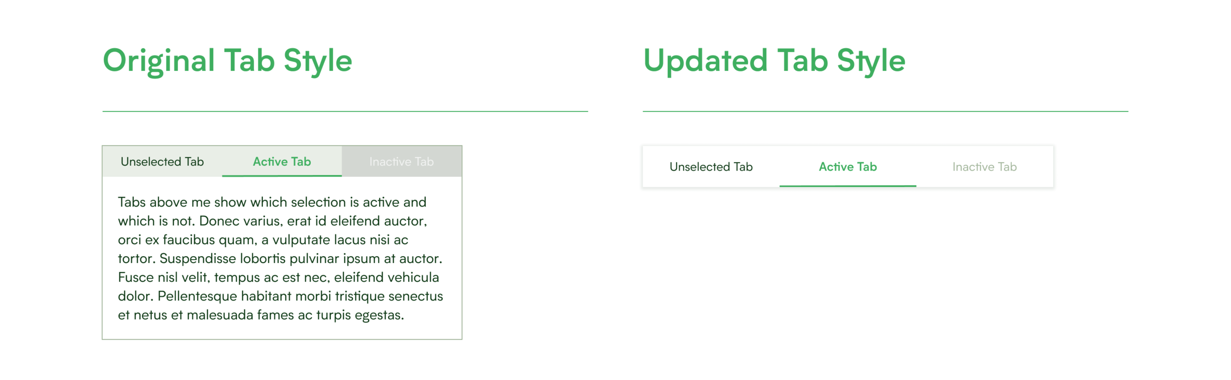
One component I was unhappy with was our tab component. Our dev team was utilizing Material UI (a Material Design based framework) to build a content library but our tabs seemed quite different and frankly worse than those in Material Design. The old design utilized a strange gray-green background color and lacked the dropshadow that characterizes an element’s spatial positioning. Additionally, although the modal container was not actually a part of the design, putting the tabs in that element made it appear as though that was the only proper usage of tabs. My fixes were simply to switch the background color to a neutral white, remove the container, and add a dropshadow. Although these were pretty simple changes, the result was a vast improvement.
Updating Tab Styles
Other key components that were missing from the design system were headers and (on mobile) hamburger menus. Part of the reason for this is that little standardization appeared to exist on the live MakeSpace site. The first part of the task was to work with our product team to audit and then standardize what links we wanted to have in both the signed in and signed out states. From there it was merely a matter of applying our new design language and relevant Material Design principles to create this component.
Header and Menu Components

Making the Design System User Friendly
The purpose of a design system is to reduce ambiguity in design, increase the speed at which individual designers can work, and help create a more consistent design throughout the product. And this means giving designers more than just raw elements to peruse. A good design system needs to be easy to navigate, offer users a framework for thinking through design decisions, and provide standardization beyond just colors, type, and components.
To make our design system easier to navigate, it was important to move away from the old system’s style of dumping everything into a single extremely long artboard on a single page, with just one other content page (for iconography) in the document. I wanted to group our content in distinct Figma pages with clear semantic labels and then further divide that content in appropriate artboard groupings, laid out from left to right with clear titles and sections.
I settled on the following page groupings: color and logos; type styles and copy formatting; grids, spacing, and alignment; components; iconography; product design values; and lastly further resources (which links out to various copy tone and branding documents). To see how content is organized within those Figma pages, you can view the full Figma file at the end of the case study in a couple of paragraphs.
Design System Navigation and Organization

I also wanted to create a set of design principles that all MakeSpace designers could use going forward as a consistent rubric for evaluating design choices and their impacts. However in my experience, companies often have design principles that are useless due to falling too far towards one of two extremes. On the one hand some companies have design principles that are so aspirational as to be unrealistic, such as calling for “transformational” design which is not the most applicable in many design situations. While on the other hand some design principles are so table stakes that they fail to offer any real guidance, like saying your design should be, “user friendly,” which is the very core of the user experience discipline.
Beyond that I wanted our design principles to be in line with the brand values and overall product positioning of MakeSpace as a company, and I wanted them to be something that all of our design and product team embraced. To that end, I started by creating a shortlist of three product design principles that made sense to me and asked the other two designers on the team to do the same. Then the three of us worked together to create a joint list that we all agreed made sense. Then we looked for duplication between the various principles we’d all offered up and worked through defining those principles. We eventually trimmed the list to five principles, gained buy in from our teammates on product and officially added the following as MakeSpace’s Product Design Principles.
Product Design Principles

One last resource that we needed was clarity on how to format and abbreviate common types of data like phone numbers, dates, times, months, etc. I began by reviewing what was live on the site and where inconsistencies appeared making a judgement call about the best and most consistent ways to standardize things. For example, I opted to use three letter abbreviations for all months of the year as that lends the cleanest and most consistent looking format.
Copy Formatting Guidelines

Conclusions
It’s hard to measure the impact of internal facing projects, like design system work, especially on a small team when you can’t measure overarching changes to say number of new features shipped or A/B tests per app release. However, I’m confident that on net the time invested in our design system not only yielded a better design system in the abstract but led to concretely better designs being shipped and a clearer understanding of what new designs at MakeSpace should look like. Take a look at the new design system for yourself.