

Smart Brush App Redesign
quip | iOS
The Context
In July of 2020, quip asked me to take over design of their mobile app. The quip app is a companion app to the company’s Bluetooth-enabled Smart Brush. Thanks to a gyroscope and other internal sensors, the brush is able to capture not only the time when a user brushes but also how long they brush for, how evenly they split brushing between upper and lower teeth, and the force with which they’re brushing. In addition to offering tracking for all this data, the app serves as a rewards platform helping customers accrue rewards points when they brush for at least 2 minutes with additional bonus points for hitting certain brushing streaks.
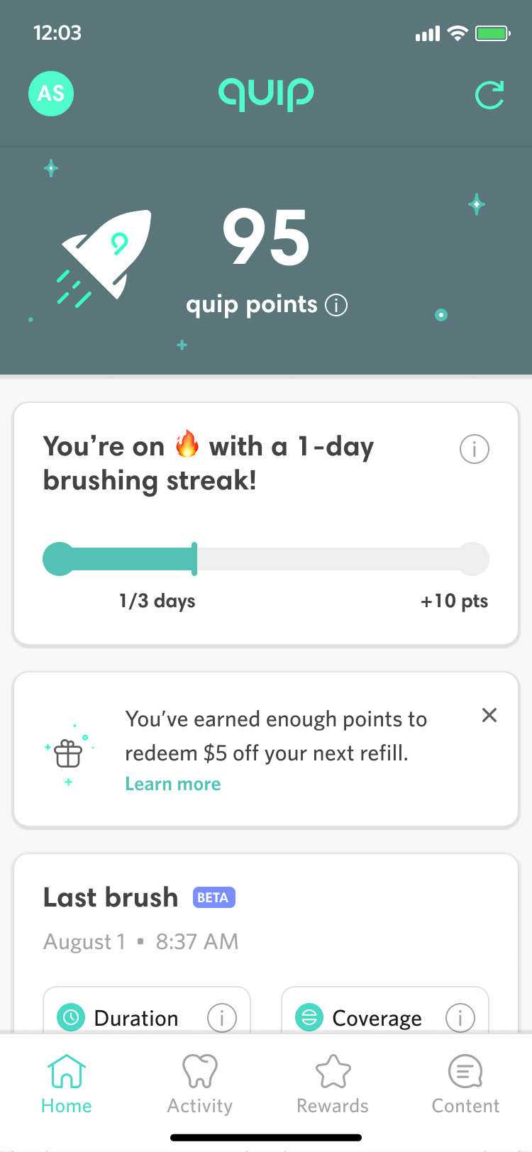
When I took over design for the quip connected smart brush app, I immediately realized that we needed to overhaul the design language of the app - particularly as it pertained to the main dashboard homescreen. From a visual standpoint, the app lacked branding or any type of clear visual hero and the content lacked an obvious hierarchy, making it hard to scan. Furthermore, much of the content at the top of the screen was of little use to the user on an ongoing basis such as the time a brush was last synced or even seeing which brush was connected since more than 90% of our users were connecting just one brush to the app. This was manifested in App Store feedback with numerous critical reviews and a low rating that hovered between 2.5 and 3 stars.
Original Designs of Home, Rewards, and Activity


Ideation
My first step was to perform a quick competitive analysis of other apps to see how home page content was laid out and organized. I then quickly sketched out how some different layout and component conventions could work. I was particularly interested in different approaches to the header and the use of bottom sheets to pin content.
Initial Sketches

Initial UI Designs
Some parts of the existing app design, like the rewards tab and the individual brush event details pages within the activity tab, already used a card-based UI, and it seemed like this would be a solid starting point for revamping the app’s design language. A modular, card-based UI, would not only make it easier to implement new features but would support a more dynamic approach to displaying the most relevant content to a given user. My initial pass was a simple, clean system of white cards on a grey background. I kept UI functionality largely the same but added a logo for branding and moved the points and streak out of the accent color dominant green area and into some card treatments.
First High Fidelity Explorations


Cleaning up Brush UI
The very top of the app was dedicated to content that logically precedes the rest of the app but has relatively little use for the user most of the time. From a data perspective, everything a user sees in the app, is tied to the brush that’s selected for syncing whether it’s loyalty points or brushing behavior. However, as mentioned before, more than 90% of users only have a single brush connected to the app. Similarly, seeing the time stamp your brush was last synced is only useful on initial app load to make sure the data you’re seeing is up to date - after that it’s not very useful. Similarly, settings apply to the entire app and hence to everything below, but are not a frequently used piece of UI relative to the prominence of the settings icon in the top right.
My next UI iteration was to group the brush information and settings behind a profile style circle with the initials of the name the user had given the brush. Tapping the profile indicator would open a bottom sheet with links to settings (and eventually notifications when we are ready to build it out) On app open, a toast would display telling the user what brush was connected and then disappear. A refresh link would display to the right and on tap, the toast would reappear showing the connected brush and displaying a syncing message until syncing completed.
Brush Switching UI in Profile


More Header Explorations
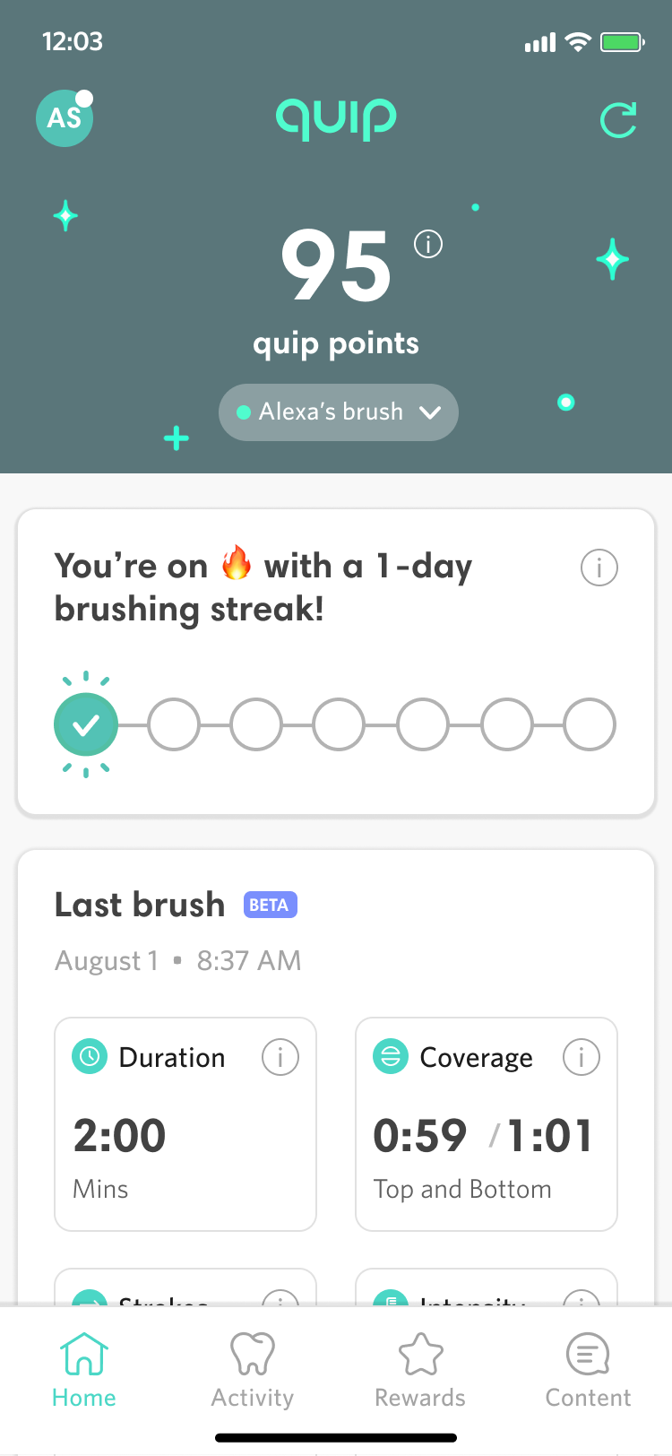
The next step in the process was to address feedback from our CEO, Simon, about making sure that the app had a true hero area and that the top section retained some aspect of the classic quip forest green as a branding element. After some discussion, we agreed that the likely most relevant hero content for a user is the number of reward points that they’ve accrued. I further proposed that we could make this feel more like a true hero area with illustration and graphical treatment of the hero area. After a number of explorations, we settled on an animated prototype I had created to position the points in the center of a starry night sky of subtly twinkling stars and lights with a single rocket ship animating past the left side. I then worked with our motion graphics designer to finalize the animation in lottie files for handoff to dev.
Finalizing the Header Designs


Solving for Multi-brush
At this point, we had a slight back to the drawing board moment as our stakeholders challenged us to create a better design for the admittedly small minority of users who had multiple brushes tied to their account. The concern was that putting the initials of the paired brush in the upper left might not make it clear enough that a user could go there to switch the currently synced brush. One proposal was to combine brush initials with the color swatch of the connected brush, but there are many brush colors quips come in a so it wasn’t aesthetically pleasing. More importantly it didn’t provide that much more differentiation for the most common multibrush scenario, which is a parent who has their children’s brushes tied to their account, since the kids smart brush from quip only comes in yellow currently. The solution I finally settled on was to bring back th full brush name in a brush switcher toggl on the dashboard… for those users who have already paired multiple brushes. For those users the switcher appears directly below the points total (since the points are also brush specific and switching the brush will change the point total).
Multibrush Solution


Enhanced Coaching
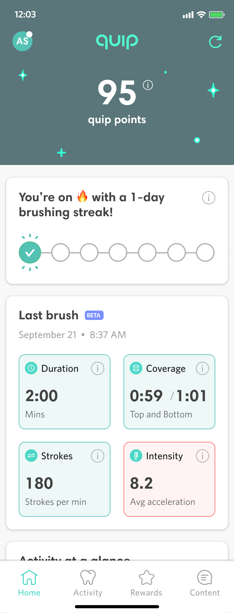
With our new UI designed, we also wanted to make a key part of the dashboard more useful for our users. The original design of the dashboard captured four key data points from a user’s last use of their connected toothbrush: the duration they brushed for, their distribution of brushing upper and lower teeth, how many up and down strokes they recorded, and the intensity of their back and forth brushing. However, this information wasn’t presented with a lot of context to the user. If the user clicked the small “i” icon on one of the last brush cards, it would offer a definition of that particular brushing metric to explain how it was calculated and why it was important but it didn’t offer much guidance about what constituted a good or bad number.
In conjunction with the product team, I pushed for our dental team and hardware team to quantify an ideal range for the duration, coverage (top and bottom), brush strokes, and intensity metrics. Based on this data, I color coded the last brush values as red when it’s outside the target range and green when it’s inside the range. When users tap on the information icon or the cell itself, the detail view now shows them their number and how it compares to the target range along with general guidance about what to do differently.
As part of the development of this feature, we also conducted an internal round of user testing with our internal beta users. While the feature was clear and helpful in general to users, one specific change was making sure kept the information icons in the upper right corner of each of the color coded brushing metrics cards. Without this icon users were less likely to know they could click the brushing metrics card for a detailed explanation.
Coaching on Dashboard and Detail Views


Results
The quip homescreen redesign went live in March of 2021. As a designer, I would have liked for use to be able to evaluate detailed metrics for engagement like average number of daily users, session duration, and micro interactions with new features like coaching tips. But due to limitations of our analytics implementation, the best metric available is the overall App Store rating.
We reset our App Store rating, which had been just 3.1 stars, shortly after the redesign went live, and roughly two months after the redesign the App Store rating is a much improved 4.7 stars.
You can view the Figma prototype.